
At some point there is a need to display a layout with border(s). And sometimes the border is required in one of the combinations of all sides (by including or excluding some). For this type of requirement, to draw border at only one side (or any combination of sides) of view or layout, there could be a lot of possible solutions. While exploring the solutions it is also required to keep over-draw and minimal rendering in mind.
For this problem we could use inset drawables.
What is Inset Drawable
InsetDrawable are drawables that insets another Drawable by a specified distance. This Drawable is useful when a View needs a background which is smaller/larger than it’s actual bounds. For defining this in XML, <inset> could be used.
How to use Inset Drawable
Inset Drawables if used via XML drawables, then they are placed inside app/src/main/res/drawable directory. It has few properties to provide inset to all sides at once or any combination of sided.

Drawable with <inset>
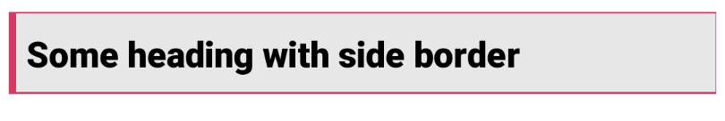
In the above image we have a TextView with one side border and black background. To create something like this we have to create one drawable file at app/src/main/res/drawable/ with following code. As you can see for a stroke width of 4dp we have made inset values to -5dp. If we keep it as -4dp then some narrow lines are still visible.
<?xml version="1.0" encoding="utf-8"?>
<inset xmlns:android="http://schemas.android.com/apk/res/android"
    android:insetTop="-5dp"
    android:insetRight="-5dp"
    android:insetBottom="-5dp">

    <shape android:shape="rectangle" android:thickness="2dp" >
        <stroke
            android:width="4dp"
            android:color="#FFEB3B" />
        <solid android:color="#040303" />
    </shape>
</inset>
The Layout File
And to put this as a background of the TextView we have made layout like this.
<?xml version="1.0" encoding="utf-8"?>
<androidx.constraintlayout.widget.ConstraintLayout xmlns:android="http://schemas.android.com/apk/res/android"
    xmlns:app="http://schemas.android.com/apk/res-auto"
    android:layout_width="match_parent"
    android:layout_height="match_parent"
    android:padding="5dp">

    <TextView
        android:layout_width="0dp"
        android:layout_height="wrap_content"
        android:layout_marginTop="20dp"
        android:background="@drawable/testing"
        android:fontFamily="sans-serif-medium"
        android:padding="10dp"
        android:text="Some heading with side border"
        android:textColor="#000000"
        android:textSize="20sp"
        android:textStyle="bold"
        app:layout_constraintEnd_toEndOf="parent"
        app:layout_constraintStart_toStartOf="parent"
        app:layout_constraintTop_toTopOf="parent" />

</androidx.constraintlayout.widget.ConstraintLayout>
Other Variant
If we want to create something like the above image, i.e. thick border at one side and narrow border at other sides then we have to make changes to the <inset> drawable like this
<?xml version="1.0" encoding="utf-8"?>
<inset xmlns:android="http://schemas.android.com/apk/res/android"
    android:insetTop="-4dp"
    android:insetRight="-4dp"
    android:insetBottom="-3dp">

    <shape
        android:shape="rectangle"
        android:thickness="2dp">
        <stroke
            android:width="4dp"
            android:color="#E91E63" />
        <solid android:color="#E8E7E7" />
    </shape>
</inset>
In this way we can modify the values and create decorative borders for any kind of views.

